Showing posts with label style guide. Show all posts

Saturday, April 28, 2012

Style Guide (Early Stages)

As the title states, these examples where done for the presentation in Wk 11 tute but the tute on that day was a bit odd. More detail can be seen in this post.

They were rushed as I only found out 2 days before the tute and on the same day, I had a Japanese test. Stressful and yet they were never shown except to my tutor. Nor did anyone else bring in a printed example, which was a bit discouraging for me and a waste of money on printing too. ;_;!

Anyways...  :


The idea of the gradient use was to show a form of timeline, so as each page is turned, the gradient bar will get darker in colour.

Paper Weights

Continuing from the post on 'Stationary' for the 'Sustenance' Style guide, this post bases on the choice of paper 'to be used' for the 'Stationary'.

My tutor brought in the Wk12 tute and whole range guide on many different paper typess, whihc I thought was pretty awsome!

But with so many, I didn't know which one to use for what 'Stationary'. Luckly at the time, there was a classmate who suggested these paper weights to use for which 'stationary'.

*There was a also a funny thing with this tute since:


and only 6 students (including me) showed up and 1 who only bought in the requirements of that task, which was me!

For:
  • Letterhead  - 100gms-110gms
  • Business card - 200gms-240gms
  • Envelope - 70gms-100gms
Thats was really helpful, which I then moved onto 'examining' different papers. The one that caught my eye, and at first pick (first booklet of paper samples) was called 'Today's News' (in both 110gms and 220gms)  from Dalton Specialty Papers; Revive Flecks. I can't find and exampl image with the paper its self is like a nearly whole processed 'washi' paper since it has 'flecks' in it and the colour is a nice very light green, which goes well with the sustenance logo. If I had gone for a white, gosh, the logo would be a bit powerful.

Friday, April 27, 2012

Example Stationary for Style guide

The new assignment and teh last one for the semester is to compile a 'Style Guide' for the brand 'Sustenance', which outlines the production of the 'sustenance' logo along with its variations, applications and how the logo should be used along with its sub-brand called 'Vittles'.

We were also given a guide to help us with the layout of it.


There was one part of it though which stated that we had to have 'stationary'. I didn't quite get what 'sort' of stationary had to be used, since stationary is a broad word and I could interperate stationary for pens. To get a better idea, I went in search (over the net) for some examples. I came across some very interesting and helpful links at that!
Looking at the examples, I got a better idea. I also asked my tutor to get a better undstanding. He said that the most simplist form of stationary was to include a letterhead(like an A4 piece of paper with logo printed on it), business card and envelope.

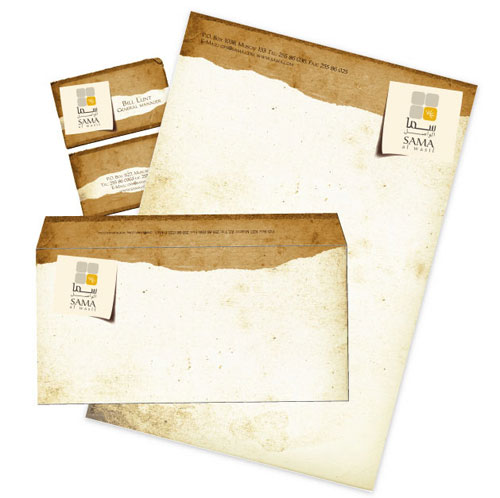
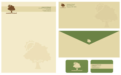
Below are some examples that I liked. The sites consisted of many other examples with more to them.