I would've made this page for the purposes of the visual diary but I've also made it because I was somewhat influenced by my tutor showing me a book called 'Symbol' (by Angus Hyland and Steven Bateman). Seeing those symbols in that book encouraged me to go out and find some inspiring examples that could help with forming my logo concept for 'Sustenance'.
The first brand that came to mind when I was introduced to 'Sustenance' was the healthy food brand called Sanitarium. Ther was also Uncle Toby's but Sanitarium poped into my mind first.
I would wonder about the concepts I'de be producing and that they'd somehow look a bit similar to Sanitarium since my ability to design always somehow has Art Nouveau or something floral incorporated.
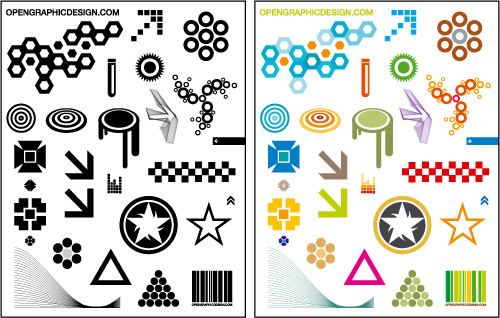
This example here shows not only creative symbols made within a circle and using simple elements but also focuses on the use of colour. The unit outline states that we are only allowed 2 spot colours so this example does help. My favourite symbol out of this example would have to be the bottom right one.
I partiularly liked the floral like implement within this symbol design. Its rather inspiring and pretty to look at.
This example looks very creative but I was strongly drawn to the symbol that looks like it forms a windmill and is made out of small circles combined together.
This example shows some interesting Japanese symbol designs. Japanese symbols, called Kamon, are facinating and pretty to look at. I particularly enjoy looking and enjoying Japanese design and culture. But with this example, I am particularly drawn to the last three in rows 2 and 3 above.
Many of theses images were found with the help of Google Images with the search topic titled:
graphic design logo symbols