Showing posts with label ideas. Show all posts

Monday, April 2, 2012

Collectable idea for my 'Vittles' concept

In order for my design concept to 'last' if it were successful, I would need to make the product collectable in someway.

Some have thought about games, some have made something or even part of the packaging interactable.
In my concept, I have chosen to do 'comics'. Yes, 'comics'. Though, not a comic strip. I've decided to make each 'panel' of a comic strip a collectable.

Why?
 This is for the sake of collecting of course. Also, by doing so, kids can jumble and make up random scenarios when they combine the panels to create a comic strip. This allows kids to be imaginative.

Each 'panel' will be a collectable fridge magnet. Each box will come with random 'panels'. The characters in the comic are based off the animal of the design.

Friday, March 30, 2012

Moodboard for Vittles

Its been a litle while since my last update and I've been preoccupied with Japanese since I've been ditching it for the sake of this unit!

This here is the moodboard for vittles. The typography.... I will further explain it in another post. As for the other elements, I've collected things that relate to 'eco' and 'friendly' with creativity. My favourite part would have to be the graphic in the middle, which represents 'texture and colour'. The image is made from a 'collage' of paper and fabric.

Below is a 'screencap' of the basic outline of the moodboard that Walter Asscociations created. The original lecture file on moodle...well I couldn't find it. I checked wk6 but the file there was a reuploaded file from wk4 lecture.

Tuesday, March 20, 2012

Lunch Boxes

This is just the research side of it.

When defining 'kids' lunch box', one would assume it to be a basic container, with perhaps a few dividers placed in it, used for placing a sandwich, some fruit a drink or for something healthy. E.g. :


Though thats not the case as lunch boxes are made to be more sophiticated to appeal to kids, as it seems that kids nowadays prefer junk over healthy. 

One of the goals in the assesment is to come up with a concept lunch box that will not only appeal but to encourage kids to have a healthier habit of eating.   

During earlier research, I came across a brand that was kinda similar to the briefs' ideals and the concepts we'd be making. The site was called 'Planet Box', only that they specialise in a reusable product and had no pre-packed lunch whereas we would be making something disposable with a pre-packed lunch.


Their product is made from stainless steel and kids can have fun 'designing' there lunch boxes with magnets. The compartments inside the box allow an interesting arrangement of food to appeal.

Another similar concept would have to be with :

http://www.biome.com.au/371-goodbyn

Their lunch boxes are called 'Goodbyn Bynto boxes'.

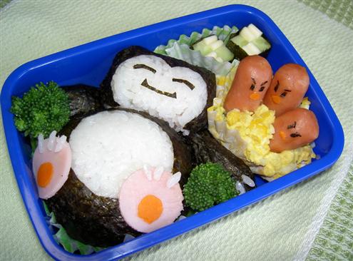
Though, what I have noticed is that Japanese lunch boxes, known as bento, tend to conquer the world of creativity in lunch boxes as the food is turned into art, which definately appeal to kids.

Bento are not only artistic but are tasty too.

Looking at lunch box concepts, physical appearance is what appeals and it seems as though Japanese design is being applied. If not Japanese, then illustrations of animations are used and are also seen on packaging to snacks as well (which doesn't seem to promote the idea of healthy).


An example of Japanese design being incorporated with lunch boxes.

And some more....


http://www.mydarlinglemonthyme.com/2012/01/healthy-banana-date-orange-cookie.html


This lunch box was made from inspiration from Japanese Bento's since the uploader of the image was a parent. The dividers in this lunch box are pretty interesting too, especially since one compartment has a lid to hide surprises in .


http://svalentine79.blogspot.com.au/2011/10/kids-lunch-box-ideas-bento-style-my.html

Dividers and cutlery are also made to look attractive to encourage children eat.

From what I see, a lot of Japanese influence is going into the idea of encouraging healthy eating.


Wednesday, February 22, 2012

Symbols!

I would've made this page for the purposes of the visual diary but I've also made it because I was somewhat influenced by my tutor showing me a book called 'Symbol' (by Angus Hyland and Steven Bateman). Seeing those symbols in that book encouraged me to go out and find some inspiring examples that could help with forming my logo concept for 'Sustenance'.

The first brand that came to mind when I was introduced to 'Sustenance' was the healthy food brand called Sanitarium. Ther was also Uncle Toby's but Sanitarium poped into my mind first.


I would wonder about the concepts I'de be producing and that they'd somehow look a bit similar to Sanitarium since my ability to design always somehow has Art Nouveau or something floral incorporated.


This example here shows not only creative symbols made within a circle and using simple elements but also focuses on the use of colour. The unit outline states that we are only allowed 2 spot colours so this example does help. My favourite symbol out of this example would have to be the bottom right one.


I partiularly liked the floral like implement within this symbol design. Its rather inspiring and pretty to look at.


This example looks very creative but I was strongly drawn to the symbol that looks like it forms a windmill and is made out of small circles combined together.


This example shows some interesting Japanese symbol designs. Japanese symbols, called Kamon, are facinating and pretty to look at. I particularly enjoy looking and enjoying Japanese design and culture. But with this example, I am particularly drawn to the last three in rows 2 and 3 above.

Many of theses images were found with the help of Google Images with the search topic titled: graphic design logo symbols

Sunday, February 19, 2012

Some supportive ideas 'Sustanence' Logo

I really had to look into examples to help form my logos. Here are some things I found that were interesting and somewhat inspiring.


I really like the 'tree'. its sooooo modern so I feel like incorporate an idea from this example.


I love the 'appple' in it. :D


The free style and combination of the man and the heart is interesting.


http://www.sustenancetoday.org/

I don't really know if I could call this a logo (just looking at the typeface used (Papyrus) and the lack of contrast) but I like the use of organic material and the ring shape applied behind it.


http://healthyadelaide.com.au/

This logo concept is sorta of similar to the first presented logo concept above. I like it as it is really simple. The artistic application used here also appeals to a 'very' young audience.