These three concepts are the finished result from my
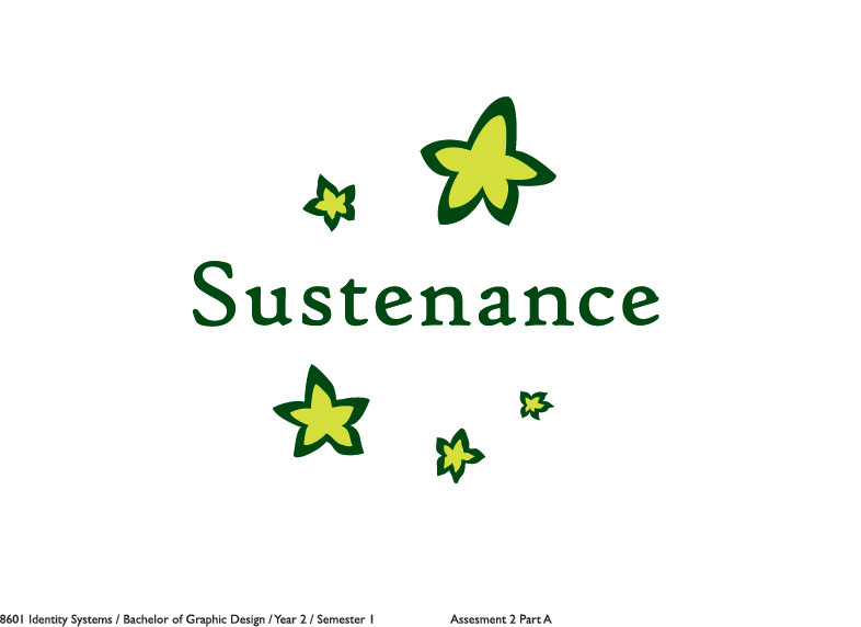
previous post, with the starfruit idea, outlined in illustrator and coloured. I also tested the logo out with some fonts and Voces stood out to me.
The logo is somewhat made to look like the starfruit shape (to promote the idea of using a fruit) and also in a way that makes in look like a shooting star.
The next day, I printed out and went to show my tutor.
Though, it got shot down! ;A;
Why?
How did it represent Australia and the company? The star is used on the flag, right and the star is a palyful and positive shape.
The shape had sharp edges which couldn't really promote the friendliness of the company.
The colours used were a bit dangerous. Black and yellow.
P.s. The company and speak of is 'Sustenance'.
Though, the tutor did help me, especially since time was running out. He gave me a suggestion to work on and that was to incorporate the southern cross (from the Australian Flag).
These two concepts show the reworking of my concept. I tried other different ways but....