Friday, March 30, 2012

Moodboard for Vittles

Its been a litle while since my last update and I've been preoccupied with Japanese since I've been ditching it for the sake of this unit!

This here is the moodboard for vittles. The typography.... I will further explain it in another post. As for the other elements, I've collected things that relate to 'eco' and 'friendly' with creativity. My favourite part would have to be the graphic in the middle, which represents 'texture and colour'. The image is made from a 'collage' of paper and fabric.

Below is a 'screencap' of the basic outline of the moodboard that Walter Asscociations created. The original lecture file on moodle...well I couldn't find it. I checked wk6 but the file there was a reuploaded file from wk4 lecture.

Tuesday, March 20, 2012

Lunch Boxes

This is just the research side of it.

When defining 'kids' lunch box', one would assume it to be a basic container, with perhaps a few dividers placed in it, used for placing a sandwich, some fruit a drink or for something healthy. E.g. :


Though thats not the case as lunch boxes are made to be more sophiticated to appeal to kids, as it seems that kids nowadays prefer junk over healthy. 

One of the goals in the assesment is to come up with a concept lunch box that will not only appeal but to encourage kids to have a healthier habit of eating.   

During earlier research, I came across a brand that was kinda similar to the briefs' ideals and the concepts we'd be making. The site was called 'Planet Box', only that they specialise in a reusable product and had no pre-packed lunch whereas we would be making something disposable with a pre-packed lunch.


Their product is made from stainless steel and kids can have fun 'designing' there lunch boxes with magnets. The compartments inside the box allow an interesting arrangement of food to appeal.

Another similar concept would have to be with :

http://www.biome.com.au/371-goodbyn

Their lunch boxes are called 'Goodbyn Bynto boxes'.

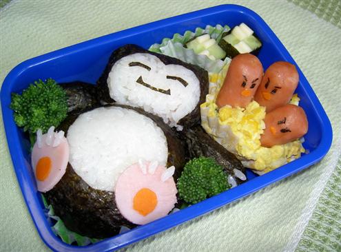
Though, what I have noticed is that Japanese lunch boxes, known as bento, tend to conquer the world of creativity in lunch boxes as the food is turned into art, which definately appeal to kids.

Bento are not only artistic but are tasty too.

Looking at lunch box concepts, physical appearance is what appeals and it seems as though Japanese design is being applied. If not Japanese, then illustrations of animations are used and are also seen on packaging to snacks as well (which doesn't seem to promote the idea of healthy).


An example of Japanese design being incorporated with lunch boxes.

And some more....


http://www.mydarlinglemonthyme.com/2012/01/healthy-banana-date-orange-cookie.html


This lunch box was made from inspiration from Japanese Bento's since the uploader of the image was a parent. The dividers in this lunch box are pretty interesting too, especially since one compartment has a lid to hide surprises in .


http://svalentine79.blogspot.com.au/2011/10/kids-lunch-box-ideas-bento-style-my.html

Dividers and cutlery are also made to look attractive to encourage children eat.

From what I see, a lot of Japanese influence is going into the idea of encouraging healthy eating.


Friday, March 9, 2012

Reworked concept


These are the reworked concepts from my submitted logo concept for 'Sustenance'. The previous font face I used was called 'High tower' but was commented as being too soft and not proffessional or corporate enough so these concepts have been created with the use and Serif based fonts.

So far 'MPH 2B' is working.

Tuesday, March 6, 2012

Submitted Concept


And here is my final piece.
.....  Which still had problems.... with the typeface....which means I'll have to rework the concept again. ;A;

More Concepts


These three concepts are the finished result from my previous post, with the starfruit idea, outlined in illustrator and coloured. I also tested the logo out with some fonts and Voces stood out to me.
The logo is somewhat made to look like the starfruit shape (to promote the idea of using a fruit) and also in a way that makes in look like a shooting star. 

The next day, I printed out and went to show my tutor.
Though, it got shot down! ;A;
Why?
  • How did it represent Australia and the company? The star is used on the flag, right and the star is a palyful and positive shape.
  • The shape had sharp edges which couldn't really promote the friendliness of the company.
  • The colours used were a bit dangerous. Black and yellow.
P.s. The company and speak of is 'Sustenance'.

Though, the tutor did help me, especially since time was running out. He gave me a suggestion to work on and that was to incorporate the southern cross (from the Australian Flag).


These two concepts show the reworking of my concept. I tried other different ways but....

More Concepts

As for this concept, it was created after I had my work overlooked from my tutor. The funny thing about it was, when I mentioned the star shape (of the apple cut in half horizontally), my tutor and I then came up with the idea of starfruit.
So, I went home and worked on some concepts with the starfruit and came up with this concept. I liked it as well, so much so I decided to use it as a final concept and thus chucked the scan into illustrator and began working on it.

And here are some starfruit examples to help me with the concept.

More Concepts

The concepts shown here were created before tute in Wk3. They were a sorta of last minute idea. Wk3's tute was based on my tutor just helping and over look our (interms of the class) concepts and helping improve or to pick a final one to use.
I sort of based these particular designs on Kamon, as Kamon used circles.

Though, I did create one or two that sorta looked alright but I don't think would be put to use. They are:
  • The one to the far left of the page. It was meant to convey a set of hands holding a heart
  • The one to the far right and positioned in the middle. It portrays a heart rising up from behind a hill, like a sunrise.

Interesting Logos

I happen to come across these which I found attractive from LogoPond.

Saturday, March 3, 2012

More Concepts


My tutor had suggested to me that I could try and extend or create better concepts from the strawberry idea. I think I may have gone a bit far though.


Reason why was because I tried to incorporate a apple into the concept. And it didn't quite work either because the concept looked like it would be sending mixed messages to people, amking them think thaat 'Sustenance' was more of a 'hybrid' product more than natural, well according to what my tutor saw. I personally thought it was kinda cute though.

Oh yes, while I was drawing these concepts, I had thoughts about how one could use an apple in the concept. One could divide up...etc but what struck me was is one were to cut an apple in half vertically, a star shape, formed form the seeds, could be seen. I have sketched out as reminder.

More Concepts


Next day, I continued to produce some more concepts. Only this time, my concepts produced here were being influenced by the two inspiring ideas, that I liked from these examples.
Circles or dots. I still sorta incorporated the orange idea again though.
Oh yes, the circles coloured red were meant to be purple to symbolise grapes though berries looked fine as well. Yep, I changed fruits again. Concepts looked alright but still didn't fit in withy 'Sustenance'. 


This page of concepts shows the further developed concepts form the previous page (above).

I showed the concepts to my tutor (including these ones). The ones that most appealed to him were the strawberry and apple 'S'. He also suggested that I should works a bit more on the strawberry idea since it could reapresent a heart as well. But if I really liked the circles idea, I could try applying it with the Southern Cross idea to incorporate a bit of Australia into the concept.


The Southern cross.


More Concepts

Time is now running out!

Here are some more concepts I came up with.


As I started to put my thoughts onto paper, the first idea to come to mind was combining the apple with the 'S' in sustenance. I was thinking about fruit. I also haven't a clue to why I picked the apple but maybe it was due to the influence of the apple concepts created by others whilst sitting in Wk2 Tute. Still fazed by the idea of fruit, I then thought about an orange. I also tried to combine the 'hat' form my brain storm but it seems to have failed.


Since the 'hat' failed, I still stuck to the orange as a basis for my concepts. Though, why did I choose an orange? Wel, because I like the floral like shapes that are formed when the orange is sliced in half or even to any other citrus. In between, I did some research for some inspiring logo ideas and there were two that I liked so I tried apply the ideas to my orange concepts. It sorta worked but made the concepts a bit ver board.
Since it was not really working for me now, I decide to use a strawberry. My ideas, I really haven't much of a clue where they come from except from things that just influence me within a certain amout of time that I've seen or had interaction with an item.
I stopped there for a bit.

Friday, March 2, 2012

Brain Storm

My tutor always sorta reminded us (students) to do a brainstorm for ideas so here is mine. It looks really sorta vague but I was focussing on Australian elements for a concept. Strangly enough, I though about using one of those Aussie farmer hats from the outback as part of my concept!

Example of the hat.


My mind map! I like the Royal Bluebell flower but it was a flower that represented a state rather than overall Australia.