Saturday, April 28, 2012

Style Guide (Early Stages)

As the title states, these examples where done for the presentation in Wk 11 tute but the tute on that day was a bit odd. More detail can be seen in this post.

They were rushed as I only found out 2 days before the tute and on the same day, I had a Japanese test. Stressful and yet they were never shown except to my tutor. Nor did anyone else bring in a printed example, which was a bit discouraging for me and a waste of money on printing too. ;_;!

Anyways...  :


The idea of the gradient use was to show a form of timeline, so as each page is turned, the gradient bar will get darker in colour.

Paper Weights

Continuing from the post on 'Stationary' for the 'Sustenance' Style guide, this post bases on the choice of paper 'to be used' for the 'Stationary'.

My tutor brought in the Wk12 tute and whole range guide on many different paper typess, whihc I thought was pretty awsome!

But with so many, I didn't know which one to use for what 'Stationary'. Luckly at the time, there was a classmate who suggested these paper weights to use for which 'stationary'.

*There was a also a funny thing with this tute since:


and only 6 students (including me) showed up and 1 who only bought in the requirements of that task, which was me!

For:
  • Letterhead  - 100gms-110gms
  • Business card - 200gms-240gms
  • Envelope - 70gms-100gms
Thats was really helpful, which I then moved onto 'examining' different papers. The one that caught my eye, and at first pick (first booklet of paper samples) was called 'Today's News' (in both 110gms and 220gms)  from Dalton Specialty Papers; Revive Flecks. I can't find and exampl image with the paper its self is like a nearly whole processed 'washi' paper since it has 'flecks' in it and the colour is a nice very light green, which goes well with the sustenance logo. If I had gone for a white, gosh, the logo would be a bit powerful.

Friday, April 27, 2012

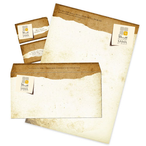
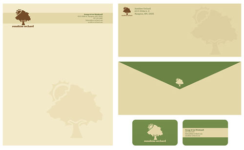
Example Stationary for Style guide

The new assignment and teh last one for the semester is to compile a 'Style Guide' for the brand 'Sustenance', which outlines the production of the 'sustenance' logo along with its variations, applications and how the logo should be used along with its sub-brand called 'Vittles'.

We were also given a guide to help us with the layout of it.


There was one part of it though which stated that we had to have 'stationary'. I didn't quite get what 'sort' of stationary had to be used, since stationary is a broad word and I could interperate stationary for pens. To get a better idea, I went in search (over the net) for some examples. I came across some very interesting and helpful links at that!
Looking at the examples, I got a better idea. I also asked my tutor to get a better undstanding. He said that the most simplist form of stationary was to include a letterhead(like an A4 piece of paper with logo printed on it), business card and envelope.

Below are some examples that I liked. The sites consisted of many other examples with more to them.


Tuesday, April 24, 2012

Vittle's lunch box in production mode pt3

Now its onto the graphics. I illustrated the graphics in Illustrator but since I have very little skills in illustrating in Illustrator, I refered to a tutorial to help. The tute was very good in instructions and the site which it came from was packed with very interesting and 'cool' tutes, which cover a wide range of things realted to graphic design.

Link: http://www.computerarts.co.uk/tutorials/creating-vector-characters-illustrator

Though, what really was a bit troubling was colour. I felt that I didn't want to use green in the beginning as the kookaburra didn't stand out so much. I soon found out that green really worked after I got some positive feed back from my tutor and some great friends. Even during the presenatation, there was good comments on the green used. But before that, I was trying blue, in a darker or less vibrant shade. To use blue, to me, felt kinda biased as it was a colour for boys. I tried purple, which reminded me of salt and vinigar, it sorta worked when I added more blue to the purple shade but did not fit the ideal of healthy. Nor red either. I wanted to avoid yellow and oranges as those colours were similar tones to the colours on the kookaburra (earth tones).


As you can see in these examples above, I had a little bit of a mind change and I made the curved corner, sit on the bottom. This emphisized the kookaburra's belly. : p Though, I found doing that, made positioning of other elements, such as a informative tick to show that the lunch box was healthy, quite tricky. Also, the feed back from my tutor, he said that I should keep the rounded corner in the top. By doing so, it also allowed me to position the elements a bit easier.


The green worked! Also, for the info on the back, I applied a gradient whereas the front uses a block colour.

I also had a bit of trouble when applying teh 'Sustenance' logo as I thought we had to have the logo in colour. But since I usesd green, the 'Sustenance' logo wouldn't stand out since it was green. I decided to dive in in the end and used a white version of the logo.

When it came to presenting, I was somewhat happy with my prototype lunchbox for 'Vittle's' but having a look at some others, they were very interesting. The ones that caught my eye were ones which the overall lunchboxes that could be reused and as a collectable item at that.

Monday, April 23, 2012

Vittle's lunch box in production mode pt2

So in this post, I get into the creating of the packaging itself.

Its rough and doesn't really show any fold or preferating lines. These were sketched up on the bases of showing me that frame that will create my box.


I drew this up thinking it would work but when I made a small prototype, I couldn't figure how to stick the back on completely. =_=!


Outline 2 was getting somewhere but then I realised that the H and W were swapped around! =_=!!


Outline 3 worked! I half in a daze when I did up Outlines 1 and 2 and my entire evening was wasted on them too. Outline 3, I had to resort to a real type of packaging base and copied it.

Many have the dimensions placed in so it would help when it came to doing the real thing in Illustrator.


This shows a close up of how the tabs would look. Also, I thought of something else to make the packaging unique and that was to cut a window out on one side of the box. That side would have the nutritional values of the lunch box. Where the window is, the fruit box can be positioned there and the window is used to display the nutritional value of the fruit box.


As for these two, these show the front of the box. The right is the front but the scan on the left shows the application of the tab, which is the beak of the kookaburra. it shows the measurements too.

With preferations, my initial goal of the packaging was to use the 'beak', which will stick out, as a tab to tear the front of the box open. On the otherside of that front or should I say 'lid' would hold further details/instructions on the collectables. Though, I did make some prototypes and tested the tearing back of the tab but... I found that it didn't really lift the entire front off but rather tore right through the middle.  This was a bit of a problem and to solve it, even though I didn't like the solution, I had to make a preferation through the middle first to allow the tab to work and then created other preferations to allow further opening, which the users would have to tear back them selves. This also kinda ruined my idea of putting the collectable details behind it.


The red indicates to pull tab to open box. Then the ares with the yellow X ark where the rest of the opening of the box takes place.
Oh yes, the tab is embedded on the side so one would would have to push the side, where the tab is located, in and pull the tabl out to make it work.

Like I said, this solution was not a great idea for opening. -___-!

Vittle's lunch box in production mode

Righteo, since I have an ok to commence production, these sketches below show the early stages of production as to what my design concept looks like.


This sketch portrays the front of the Vittle's lunch box. The animal is a kookaburra. I decided to base the animal/mascot design on Australain animal to promote the idea of the product being Australian and also the mascot idea was inspired by the mascots used in the 2000 Sydney olympics.


I didn't make one for the back of the lunchbox but the layout was pretty much made up on the spot.

Now, as for the shape of the box:


Its a retangle of 18W x 20H (in cm) with a depth of 5cm. I can assure that I went out and took measurements of the items being placed inside the lunch box. I also made it so so that it would fit into a child's school bag without bulkiness!

The retangle shape would also have a rounded corner on the right side. I thought that I could make the lunch box somehow unique.
I showed this idea to my tutor to get a better opinion on any improvements and etc. I got some good feedback but the bad part was the curved edge. The curved workd but if the actual concept was to be mass produced in reality, it'd be hard and tedious to make. Though, if I wanted to keep the curved idea, I could instead create a illusion filling the negative space of the curve with white whilst keeping the physical lunchbox a retangle.

Oh yes, during the process of creating my concepts, I wanted to stray away from the idea of using a retangle as it was very common and I wanted to strive for some uniqueness, which is why I made a corner curved.