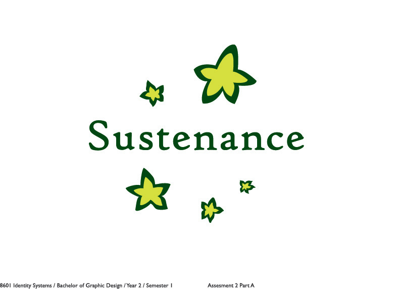
We were allowed to improve on or change our logo concepts for 'Sustenance', which is really good since we're were given a second chance.
This here is my reworked 'sustenance' logo. not much change except in the stars. It was a suggested idea after a consultation with my tutor.
Showing posts with label Logo. Show all posts
Thursday, April 19, 2012
Friday, March 9, 2012
Reworked concept
These are the reworked concepts from my submitted logo concept for 'Sustenance'. The previous font face I used was called 'High tower' but was commented as being too soft and not proffessional or corporate enough so these concepts have been created with the use and Serif based fonts.
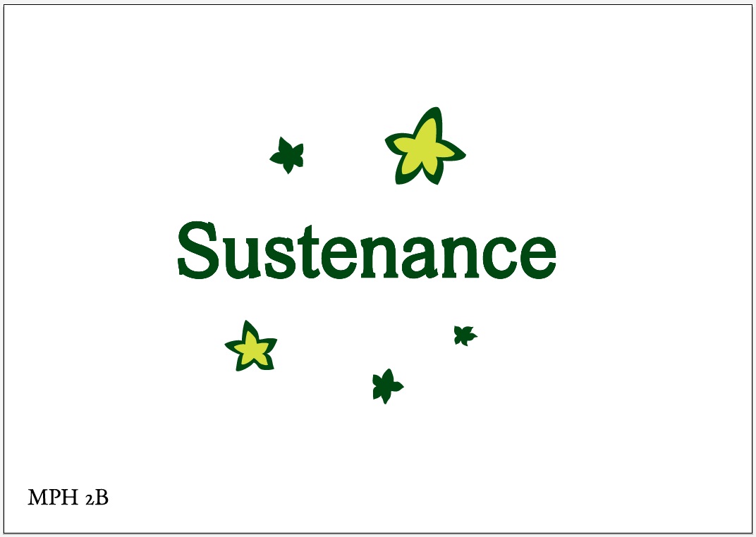
So far 'MPH 2B' is working.
Tuesday, March 6, 2012
Submitted Concept
And here is my final piece.
..... Which still had problems.... with the typeface....which means I'll have to rework the concept again. ;A;
More Concepts
These three concepts are the finished result from my previous post, with the starfruit idea, outlined in illustrator and coloured. I also tested the logo out with some fonts and Voces stood out to me.
The logo is somewhat made to look like the starfruit shape (to promote the idea of using a fruit) and also in a way that makes in look like a shooting star.
The next day, I printed out and went to show my tutor.
Though, it got shot down! ;A;
Why?
- How did it represent Australia and the company? The star is used on the flag, right and the star is a palyful and positive shape.
- The shape had sharp edges which couldn't really promote the friendliness of the company.
- The colours used were a bit dangerous. Black and yellow.
Though, the tutor did help me, especially since time was running out. He gave me a suggestion to work on and that was to incorporate the southern cross (from the Australian Flag).
These two concepts show the reworking of my concept. I tried other different ways but....
Wednesday, February 22, 2012
Symbols!
I would've made this page for the purposes of the visual diary but I've also made it because I was somewhat influenced by my tutor showing me a book called 'Symbol' (by Angus Hyland and Steven Bateman). Seeing those symbols in that book encouraged me to go out and find some inspiring examples that could help with forming my logo concept for 'Sustenance'.
The first brand that came to mind when I was introduced to 'Sustenance' was the healthy food brand called Sanitarium. Ther was also Uncle Toby's but Sanitarium poped into my mind first.
Many of theses images were found with the help of Google Images with the search topic titled: graphic design logo symbols
The first brand that came to mind when I was introduced to 'Sustenance' was the healthy food brand called Sanitarium. Ther was also Uncle Toby's but Sanitarium poped into my mind first.
I would wonder about the concepts I'de be producing and that they'd somehow look a bit similar to Sanitarium since my ability to design always somehow has Art Nouveau or something floral incorporated.
This example here shows not only creative symbols made within a circle and using simple elements but also focuses on the use of colour. The unit outline states that we are only allowed 2 spot colours so this example does help. My favourite symbol out of this example would have to be the bottom right one.
I partiularly liked the floral like implement within this symbol design. Its rather inspiring and pretty to look at.
This example looks very creative but I was strongly drawn to the symbol that looks like it forms a windmill and is made out of small circles combined together.
This example shows some interesting Japanese symbol designs. Japanese symbols, called Kamon, are facinating and pretty to look at. I particularly enjoy looking and enjoying Japanese design and culture. But with this example, I am particularly drawn to the last three in rows 2 and 3 above.
Many of theses images were found with the help of Google Images with the search topic titled: graphic design logo symbols
Sunday, February 19, 2012
Some supportive ideas 'Sustanence' Logo
I really had to look into examples to help form my logos. Here are some things I found that were interesting and somewhat inspiring.
I really like the 'tree'. its sooooo modern so I feel like incorporate an idea from this example.
I love the 'appple' in it. :D
The free style and combination of the man and the heart is interesting.
http://www.sustenancetoday.org/
I don't really know if I could call this a logo (just looking at the typeface used (Papyrus) and the lack of contrast) but I like the use of organic material and the ring shape applied behind it.
http://healthyadelaide.com.au/
This logo concept is sorta of similar to the first presented logo concept above. I like it as it is really simple. The artistic application used here also appeals to a 'very' young audience.
Week 1 Activity 3 - Moodboard and first logo concepts
This here is my mood board, set up to 'loo like' the one shown in the activity outline. But, apparently, the content displayed misses the mark!
My mood boared encompasses colours inspired by what the brief somewhat calls for. So now what do I do? Do I 'ditch' it? I'm just going to do a mind map for this time being.
Sketches
The example above is a compilation of the first set of sketches. The consisted of combing the linseed flower. I chose linseed as it was the first thing that just randomly popped into my mind whilst thinking about 'healthy' and because my mum enjoys snacking on snacks with linseed in them. :P
Though, my designs seemed a bit to floral. I have a strong nack for creating Art Nouveau designs. I wanted to create something a bit more modernised so I came up with this next set of concepts.
To add a bit of modernisation, I decided to 'shape' or add more solidity to my designs. But then had a second thought about them as they looked liked logo's for a programming or computer based company.
The last few sketches on the bottom of the page were ones I came up with during the wk 2 lecture. The concept of them consists of combining a 'tick' (which I made out to be leaves at first) a linseed flower.
I liked how it looked and thought about using it as a final concept but then later on during the day, changed my mind and thought it would be better to represent Sustanance's brand called 'Vitties' as the tick could be used to show the 'V'.
This example shows some extended ideas off the 'tick'.
And this example above shows off a bit of 'modernising' added to the tick idea.
Apparently, all of my ideas were sorta out of range so now I have to rethink or 'research' the 'meanings' for any elements I decide to include in my logo concepts.
Monday, February 13, 2012
Week 1 Activity 2 Part 3 - Logo 'Re-'designing
Idea: To take a silhouette from a or of a symbol,logo...etc and 're'-use it to create new logo forms from it.
This is what i've been able to make of the Emu from the Australian coat of Arms. :)
Subscribe to:
Posts (Atom)