A sub-brand off 'Sustenance' and you couldn't really make 'V' a tick!!!! ARRRGGGGHHH!
It was a challenge!
The target audience is a young one so the readability must be legible and simple and fun!
So I went in search of friendly type faces and found :
- http://www.quora.com/Typography/What-are-some-friendly-typefaces-that-arent-too-feminine-or-overly-cute - a forum like site which suggests 'friendly' fonts. These fonts suggested would consist of having rounded ends.
but I cannot recall the link and I believe I came across it during a google image search.
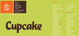
This link's site consisted of typefaces that appeared to be curvacious & playful with perhaps 70% of all the typefaces there having soft or rounded edges. One caught my eye and it was called 'cupcake', which somewhat depicted what I wanted to use for the 'Vittles'. The typeface has soft/rounded edges, is strongly readable and was somewhat playful.
*Oh yes, I was suppose to mentions this at the beginnning but in my design, I wanted to incorporate san-serif based fonts for readability.
Since I liked the typeface, I went insearch of a site where I could download it but instead came across this site and its version of 'cupcake' which definately fit in with my concept idea. It's playful, fun and worked well as a font for children.
Though it fitted my idea, I couldn't find a link nor a download to it. Neither to the one from Sudtipos (sudtipos.com). The best I could really do was search replacement fonts that had a similar resemblence or fitted the criteria of having soft/rounded edges and was fun. I used fonts from Dafont and Google Font.
The two best out of 10 I had found as a replacement were:
Patrick Hand
laCartoonerie
(http://ilovetypography.com/2008/02/03/sunday-type-frodo-type/) (just happen to come across this link and placed it here as some form of reference)


No comments:
Post a Comment